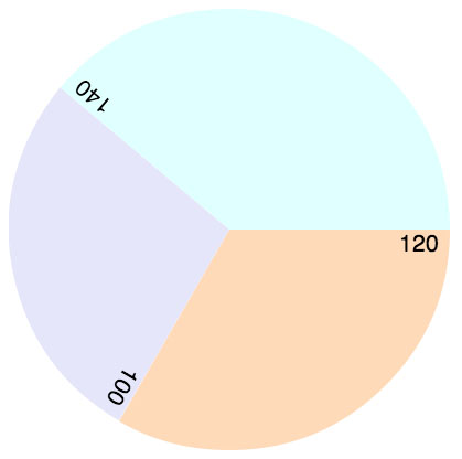
One of the best things about the HTML5 <canvas> element is that we can now do things like this:
without needing a plug in. I recently had to implement a similar type of graphic in canvas for a project I’m working on, so I thought I’d turn it into a tutorial on how to make a pie chart.
Rather than just hardcoding the functions to make a specific pie chart, let’s write it so you can easily change the data. That way, you can reuse the code any time you need to display a pie chart. So, we’ll first create an array of data, an array of labels, and an array of colors:
var data = [120, 100, 140];
var labels = ["120", "100", "140"];
var colors = ["#FFDAB9", "#E6E6FA", "#E0FFFF"];
Data contains numbers that add up to 360 (so we can make a complete circle). Each number corresponds to a segment of the pie chart. Labels contains strings that will be used to label the segments of the pie chart, and colors contains colors that will be used to color the segments.
Next we can write a function, drawSegment that will draw one segment, specified with the parameter i, using these values:
function drawSegment(canvas, context, i) {
    context.save();
    var centerX = Math.floor(canvas.width / 2);
    var centerY = Math.floor(canvas.height / 2);
    radius = Math.floor(canvas.width / 2);

    var startingAngle = degreesToRadians(sumTo(data, i));
    var arcSize = degreesToRadians(data[i]);
    var endingAngle = startingAngle + arcSize;

    context.beginPath();
    context.moveTo(centerX, centerY);
    context.arc(centerX, centerY, radius,
                startingAngle, endingAngle, false);
    context.closePath();

    context.fillStyle = colors[i];
    context.fill();

    context.restore();

    drawSegmentLabel(canvas, context, i);
}
In this code, we first save the context so we can restore it later (that way, it’s safe to use with other canvas code). Remember, when you save/restore the context, you’re basically putting the context back into the state it was in you saved it.
Next, we find the center of the canvas, to use as the center of the pie chart, and compute the radius of the circle.
The starting angle is the sum of all the data so far (since each data point corresponds to a segment of the circle), so I wrote a helper function to sum up the first i segments of the array (see below). For example, if we’re drawing the third segment, i will be 2, and we’ll add 120 and 100, for a starting angle of 220. One of the trickiest things about learning to draw circles and arcs in canvas is understanding the starting and ending angles and the direction you’re drawing the arc, so review Chapter 7 in Head First HTML5 Programming if you get confused about this (I know I do even though I’d done it lots of times now!).
The ending angle is just the starting angle plus the arcSize, which is just the number in the data array corresponding to the segment we’re drawing. Note that I’m converting everything from degrees to radians, using another helper function (see below), since that’s what the context method to draw the arc expects.
Now we’re ready to draw the arc. We move the canvas “pen” to the starting point, which is the center of the circle, draw the arc, and then close the path, so we get a pie wedge shape. Remember that the last argument to the context.arc method is the direction we’re drawing the arc; in this case, false means we’re drawing in a clockwise direction around the circle. The starting angle starts from the east side of the x axis, and goes around clockwise when we use positive angle measurements, so that’s why we draw the arcs in a clockwise direction.
Finally, we need to fill the arc, so we pick the color from the array, and fill the path we’ve just drawn. We restore the context, and we’re done drawing that segment. The last thing we do in the function is call another function, drawSegmentLabel, to draw the label.
Before we get to drawSegmentLabel, here are the helper functions, degreesToRadians and sumTo:
function degreesToRadians(degrees) {
    return (degrees * Math.PI)/180;
}
function sumTo(a, i) {
    var sum = 0;
    for (var j = 0; j < i; j++) {
      sum += a[j];
    }
    return sum;
}
The function drawSegmentLabel adds the labels to the pie chart. You might wonder: how are we going to get the text rotated to match the segments? The trick to rotating the text for the labels is to rotate the context – it’s like you’re picking up the canvas, moving it and rotating it, and drawing the text as as normal. By saving and restoring the context each time the function is called, we make sure that the context goes back to its normal position after each time we call the function.
function drawSegmentLabel(canvas, context, i) {
   context.save();
   var x = Math.floor(canvas.width / 2);
   var y = Math.floor(canvas.height / 2);
   var angle = degreesToRadians(sumTo(data, i));

   context.translate(x, y);
   context.rotate(angle);
   var dx = Math.floor(canvas.width * 0.5) - 10;
   var dy = Math.floor(canvas.height * 0.05);

   context.textAlign = "right";
   var fontSize = Math.floor(canvas.height / 25);
   context.font = fontSize + "pt Helvetica";

   context.fillText(labels[i], dx, dy);

   context.restore();
}
After saving the context, we figure out the center of the circle, and then the angle to rotate the context so we can draw the text. The angle is the same as the starting angle we used for the segment in the drawSegment function (ie, the sum of all the data so far, converted to radians).
Once we have the angle, we translate, or move, the top left corner of the context to the center of the circle and then rotate it (clockwise) to the angle that matches the starting angle of the segment. Then we adjust the horizontal starting point of the text so it’s at the edge of the pie chart (since the text is right aligned, we’re setting the right side of the text box here). I subtracted 10 pixels to get it a bit of space on the right side. We also adjust the vertical position of the text so it has a little space above it, and fits just below the top of each segment.
Once we’ve got the position for the text figured out, we set the text alignment and font size. Notice that I’m computing the size of the font based on the size of the canvas (the pie chart is also sized to the canvas). Feel free to play with the number 25 to adjust the font size until you are happy with it (and try changing the canvas size in the HTML to make sure it works at a variety of sizes).
Finally, we fill the text with the label for the segment.
Now all we need is the code to get the canvas and the context and call the drawSegment function to draw all the segments. This code assumes you’ve got a canvas with the id of “piechart”.
canvas = document.getElementById("piechart");
var context = canvas.getContext("2d");
for (var i = 0; i < data.length; i++) {
    drawSegment(canvas, context, i);
}
And here’s the HTML you need (adjust the canvas size and you should see the pie chart change size too!):
<canvas id="piechart" width="400" height="400">
</canvas>
Enjoy, and let me know if you make any pie charts. I’ve posted the full code on github; it’s a little different–it’s set up to create a PieChart object, and drawSegment and drawSegmentLabel are methods of the PieChart object rather than functions, but it is basically the same idea.


Thank you very much for this awesome piece of code, Elizabeth. I have a question regarding the rotation of the text on the slices. Is there any way that the text can be changed to show along the outer arc of each slice? Would really appreciate any help you can offer. Thanks, Johann
There is no built-in method for writing text along a path so you have to do it yourself by rotating each letter as you write it. I can do another tutorial on that!
You would be my HERO! You’ve already helped me so much with this wonderful article, I would really really appreciate it! I’m very new to HTML5 coding, so I can use all the help I can get! 🙂
Nice tutorial — thanks. There’s a typo on the drawSegment() function where a line is closed with a colon instead of a semicolon. The line says “context.fillStyle = colors[i]:”. Needs to be context.fillStyle = colors[i];
Also, the degreesToRadians function is missing the parameter component and paratheses. Should be degreesToRadians(degrees).
Thanks Jude!
this is a great tutorial. can you have multiple pie charts on the same page? how would that be done? can you create multiple instances of the piechart class? I’m trying to create multiple MySQL database queries and populate several pie charts with the results. Thanks
I tried using this, but it didn’t create what I needed.. I wrote one myself (Including PHP to get all pie charts) and it turned out pretty nice. Though this is a very useful article!